
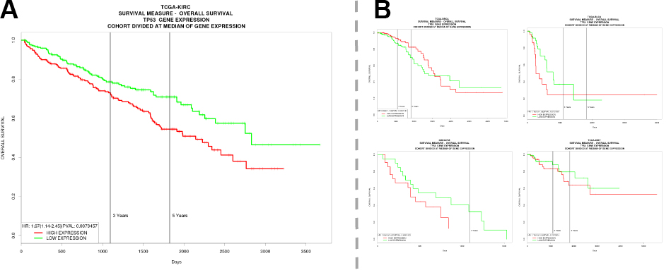
I am interested in what a certain gene’s overexpression means in terms of cancer patient survival. A standard way of visualizing this sort of data is using Kaplan-Meier curves, as shown below. But I really wanted an overview of many cancers, not just one, to be able to quickly see what effects the expression has across the board. You could insert multiple Kaplan-Meier curves next to each other – some papers do that – but I was interested in a more visually pleasing and informative approach.
I thought I would use a so-called forest plot, by visualizing the hazard ratio – i.e. the increase chance of death caused by overexpression of the gene – instead. These plots are normally a bit boring, but Nate Silvers team at Fivethirtyeight have created some beautiful visuals that I thought I would try to emulate in R. Now this isn’t great, but it’s a beginning. Here’s the R code:
And here’s the result:
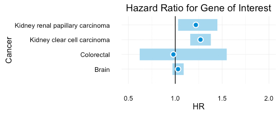
I like this visualization better, as you can easily see and interpret the effects across a number of cancers. I think I’ll try and add in the P-value and numbers as well (later). The code is based on Stephen Turner’s code, with some tweaking. Survival data is easily available through the PROGgeneV2 website.
References:
1. Chirayu Pankaj Goswami and Harikrishna Nakshatri. ”PROGgeneV2: enhancements on the existing database”. BMC Cancer, 2014.
2. FiveThirtyEight website. “Who will win the presidency?”. Link: http://projects.fivethirtyeight.com/2016-election-forecast/.
Thank you so much for posting solution! I was looking for a a way to have forest plot for mu survival models all at one plot! It helped a lot.